Data Visualization Best Practices
Hitchcock said the size of a thing on screen should match its importance to the story. A coffee cup that contains poison should be the biggest thing in the frame, even if the actor holding it is six inches tall. Most data visualization gets this exactly backwards. The biggest thing on the chart is whatever the BI tool defaulted to. The actual important number is in the corner, in nine-point font, where nobody will look.
The honest version of data visualization advice is that almost all of it can be reduced to one principle: make the thing that matters look like the thing that matters. Everything else is variations on that idea, dressed up as separate rules.
Most chart problems come from forgetting this. A dashboard with twelve metrics treats every metric as equally important, because the grid is uniform. That uniformity tells the viewer "these are all the same kind of thing," which is almost never true. Three of those metrics drive decisions. The other nine are context. A well-designed dashboard makes the three obvious and lets the nine recede. A poorly-designed one makes them all the same size and lets the viewer figure it out.
Color works the same way. Most BI tools default to a categorical palette where every series gets a distinct color. The result is a chart where every line is screaming for attention, which means none of them get any. The fix is almost always to pick the one or two series that matter, color them with intent, and gray out the rest. The grayed-out lines provide context. The colored lines provide the story. The viewer's eye goes where the design tells it to go.
A few patterns I keep coming back to:
- Start with the decision, not the data. The question isn't "what should I visualize." The question is "what decision is this chart supposed to inform." If you can't name the decision, you can't design the chart, because there's no criterion for what to emphasize.
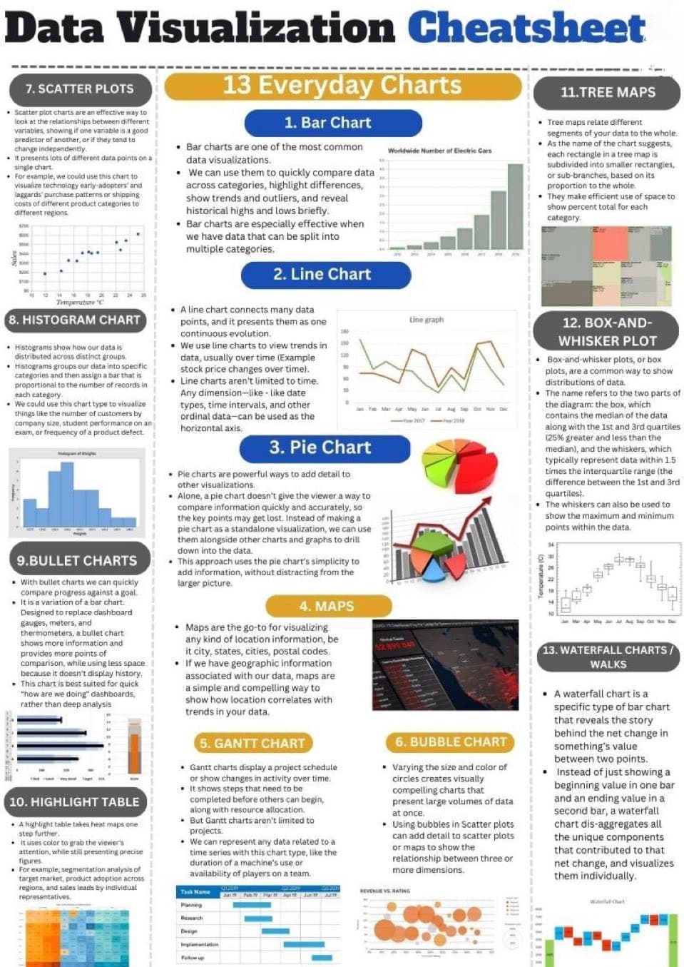
- Pick the chart type for the comparison you're making. Bars for comparing categories. Lines for showing change over time. Scatter for relationships between two variables. Pie charts for almost nothing. The choice of chart type encodes the question you're asking. Get it wrong and the chart becomes a riddle.
- Annotation is the difference between a chart and a story. The line going up and to the right tells you something happened. A label saying "campaign launched here" tells you what. The annotation is usually the part the analyst skipped because they were tired by the end. It's also the part that makes the chart legible to anyone who wasn't in the original meeting.
- Strip the chart junk. Gridlines that don't add information. Borders that compete with the data. Tooltips that repeat what the axis labels already said. Every visual element on the chart should be there because it helps the viewer understand the data. If it's there because the tool put it there by default, take it out.
- Don't lie with axes. Truncating the y-axis to make a small change look large is the oldest trick in the book and the easiest to spot. Inverting an axis to flip the visual direction. Using dual axes to imply correlation between things that aren't actually related. These tricks survive because they sometimes work in the short term. They erode trust permanently when they don't.
- Test the chart on someone who wasn't in the meeting. The chart that's obvious to you is rarely obvious to the person reading it for the first time. If the test reader has to ask what they're looking at, the chart isn't done. Iterate until the response is "oh, I see" instead of "wait, what is this."
The interactive question is its own thing. Interactive dashboards are everywhere because tools make them easy. Most of them are worse than a single well-designed static chart, because interactivity transfers the work of finding the insight from the analyst to the viewer. The viewer doesn't want to do that work. They want to be told the answer. Reserve interactivity for cases where the viewer genuinely needs to explore, and use static charts for cases where the answer is known and the chart's job is to communicate it.
The deeper thing about visualization is that it's a translation problem more than a design problem. The data is in one language. The viewer thinks in another. The chart is the translation, and like all translations, the value isn't in the technical accuracy of the conversion. It's in whether the meaning survives the trip. Most charts get the technical part right and lose the meaning along the way.
Some of the best visualizations are not even of business data. I've spent time mapping Gershwin's Rhapsody in Blue into a circular layout that shows time, pitch, instrument entries, and chord patterns moving against each other. It's a finger exercise, mostly, and it has nothing to do with revenue or customer churn or any of the dashboards anyone pays me to build. But the discipline of figuring out how to render music visually, where the source material is so dense that bad design choices show up immediately, has made me better at the dashboards. The constraints are sharper. The judgment of what to leave out and what to highlight gets exercised harder. If you do this work professionally, find something nobody pays you to visualize and build it anyway. The lesson transfers.
Hitchcock's coffee cup is in the frame because the audience needs to see it. Everything else in the shot is composition. Most charts forget this. The good ones remember.