The Intersection of Music and Data Visualization
Music was the first field to take data visualization seriously. A thousand years before anyone built a bar chart, monks were drawing neumes above Latin text to show pitch and duration, inventing the visual grammar that became Western notation. Every chart anyone makes today stands on that lineage. The score is a data visualization. The chord chart is a data visualization. The spectrogram is a data visualization. Music has been a visual medium for as long as it's been a written one, and most of what we know about how to make information legible at a glance was figured out by people trying to write down a song.
I think about this a lot when I'm doing visualization work, because the discipline is the same regardless of whether the source material is audio or financial data or parking transactions. The visual artifact is a translation. The translation makes things visible that the unaided senses couldn't have caught. The translation also leaves things out, and the things it leaves out are sometimes the things that matter most. Good visualization is the practice of choosing well between what to show and what to lose, and being honest about the loss.
Most of my visualization work over the years has been on standard business data. Dashboards for parking demand at UW Transportation Services. Customer review patterns at Beats by Dre. Investment analyses at HP Tech Ventures. The discipline transfers. But the place where I've gotten the most reps, and where I've learned the most about what visualization can and can't do, is in the work that nobody asked for: visualizing music itself.
The MIDI to CSV tool I built does the simple version of this. Take a MIDI file, extract the note events, the durations, the velocities, the chord structures, and write them out as a tabular dataset that can be analyzed and plotted with standard tools. Once you have that data, you can do things that aren't quite analysis and aren't quite music: plot the distribution of note durations across Bach's solo cello suites, compare the rhythmic complexity of early Beatles to late Beatles, look at how the harmonic vocabulary of a Coltrane solo evolves measure by measure across a single tune. The plots are sometimes beautiful and sometimes ugly. They're almost always teaching me something I couldn't have heard.
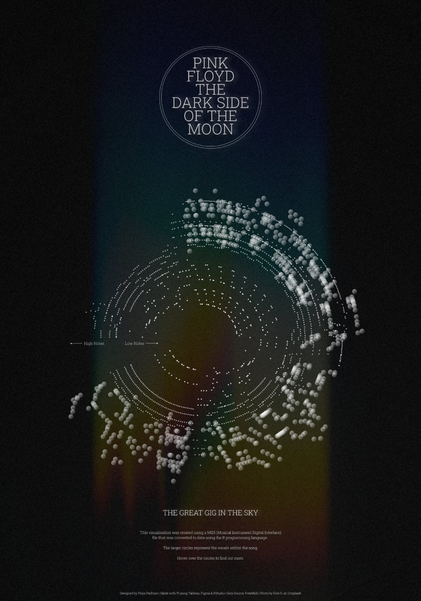
The bigger project, and the one I keep going back to, is a circular visualization of Gershwin's *Rhapsody in Blue*. Time wrapped around the circle, pitch as radius, instrument entries marked as colored arcs, chord patterns plotted as inner rings. The piece runs about sixteen minutes. The visualization renders the whole structure as a single image, where you can see the famous clarinet glissando opening curling out from the center, the orchestral entrances stacking up against the piano, the chord movements spiraling through the keys. None of this is necessary to enjoy the music. But the visualization makes legible something that the linear listening experience flattens, which is the architectural shape of the piece. Gershwin built it as a structure, not just as a sequence, and the visual makes the structure visible.
A few things I've learned from doing this kind of work that have made me better at the more ordinary visualization I do for clients:
Constraints sharpen judgment. When the source material is dense and the screen is finite, every design choice has to earn its space. A bad chart wastes pixels on decoration. A good chart treats every pixel as load-bearing. Music is unforgiving in this regard because there's so much information per second that any visualization has to make brutal decisions about what to keep. Practicing those decisions on music makes the same decisions easier when the source is a quarterly revenue dataset.
The right visualization is often the one that surprises the source material. The standard chart types exist because they work for most cases. The interesting visualizations are the ones that match the structure of the data instead of forcing the data into a standard shape. Gershwin in a circle works because the piece is rondo-like in its returns and developments, and a circle honors that structure in a way that a linear timeline doesn't. The same instinct applies to business data. The chart should fit the data's shape, not the other way around.
The discipline of subtraction is the discipline. Every visualization I've made started with too many elements and got better as I removed them. Color reduced. Annotations cut. Gridlines stripped. The final version always has fewer things on it than the first draft. The skill is knowing what to take out, and the only way to learn it is to take things out and see what survives.
Visualization fluency is hearing fluency. The audio engineer who can hear a recording in a spectrogram has trained the same skill that lets a good analyst see a quarterly trend in a sparkline. The medium is different. The cognitive move is identical: years of looking at the artifact until the artifact and the underlying thing become the same object.
The deeper thing about music and data visualization is that they've been the same field all along. The score is a visualization. The waveform is a visualization. The spectrogram is a visualization. Music has always been one of the most visualized art forms, because the act of writing it down required inventing notation systems that could carry the structure of sound through space and time. Every chart I make for a business problem stands on top of a thousand years of musical notation history. The lessons are the same lessons. The constraints are the same constraints. The discipline is the same discipline.
Miles Davis said he'd spent years learning what notes to play, and the rest of his life learning what notes to leave out. Visualization is the same discipline taken to a different medium. Every chart is a record of decisions about what to leave out, and the good ones are the ones where the absences are doing as much work as the presences. The empty space on the page is where the viewer thinks.